![]()
This page is dedicated to displaying example
DataSplash visualizations (splashes). We would be delighted if you would
share your visualizations with us. If you would like to submit them, please
send email to datasplash@cs.berkeley.edu.
The section Description of DataSplash Software in the Overview gives a high-level introduction to the components of the DataSplash software. This information is helpful in understanding the visualizations below.
![]()

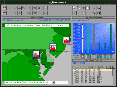
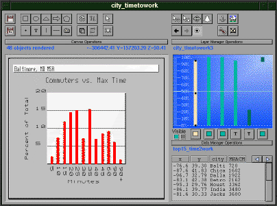
|
A splash of the United States average commute
time to work. These screen shots appear in the Quick
Tour.
In the first screen shot, the colors of each state represent the average commute time to work in that state. The key for these colors appears in sticky objects so that the key remains in the same location as the user pans and zooms in the visualization. In the second screen shot, the camera is focused on one of the interesting points in the visualization: the state of Maryland has a long commute time as indicated by its dark green color. As the user zooms into the canvas, splash portals onto another canvas appear. These portals contain red bar chart graphs of the average commute time for the larger metropolitan areas. The name of each metropolitan area also appears. In the third screen shot, the user has gone through the portal to the canvas with the bar charts. The camera is focused on the Baltimore metropolitian region. The bar chart shows the percentage of workers who commute for various amounts of time. Author: Mybrid Spalding (Tioga Research Group) |
![]()
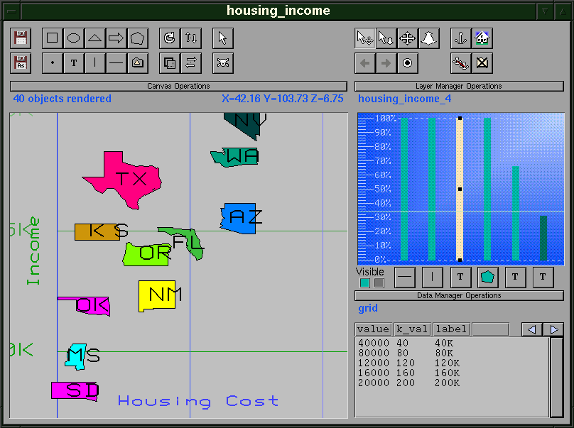
|
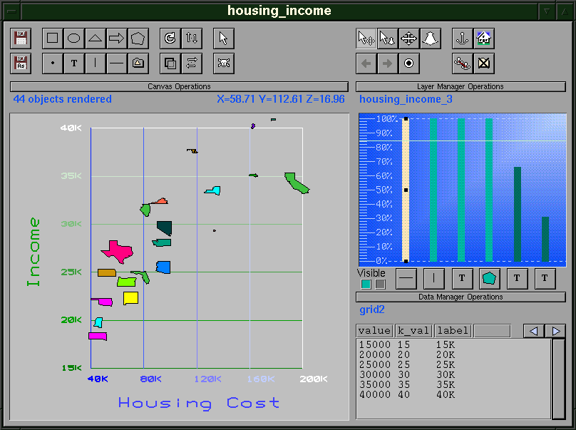
A splash comparing average housing cost
and income for selected states. The visualization is a scatterplot (housing
cost appears on the x axis and income on the y axis). An
icon of the shape of each state represents its location in the scatterplot.
More specifically, each row in a database table represents a state. Each state is assigned a location based on the average housing cost and income in that state. Then an icon of the state is placed at that location. An underlying grid is color-coded to indicate housing cost and income values. In the first screen shot, the visualization is seen from a high elevation. The second screen shot presents a zoomed-in view in which state names have appeared. Further zooming reveals the precise average housing cost and income for each state. Author: Allison Woodruff (Tioga Research Group) |
![]()
|
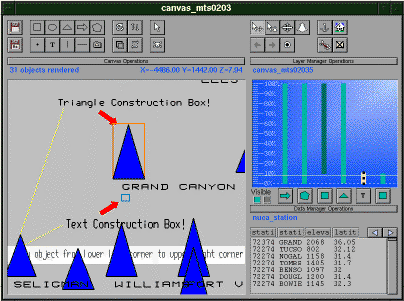
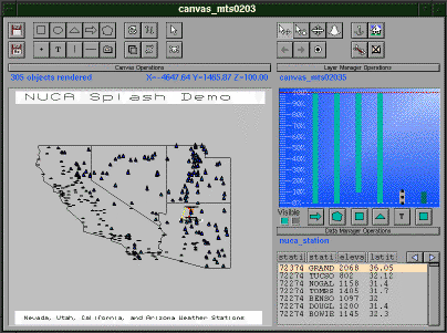
A splash showing the elevations of the
weather stations for Nevada, Utah, California, and Utah (NUCA). These screen
shots appear in the Splash Tour.
In the first screen shot, a triangle appears for each of the weather stations in a database table. The height of each triangle is determined by the altitude of that weather station. From this viewing position, the user can verify that the coastal stations in California are at lower altitudes than those in Utah. In the second screen shot, the user has zoomed in. Examination of the triangles shows clearly that certain triangles are taller than others. Further, trim objects are used within the visualization to annotate points of interest. Author: Mybrid Spalding (Tioga Research Group) |
![]()
|
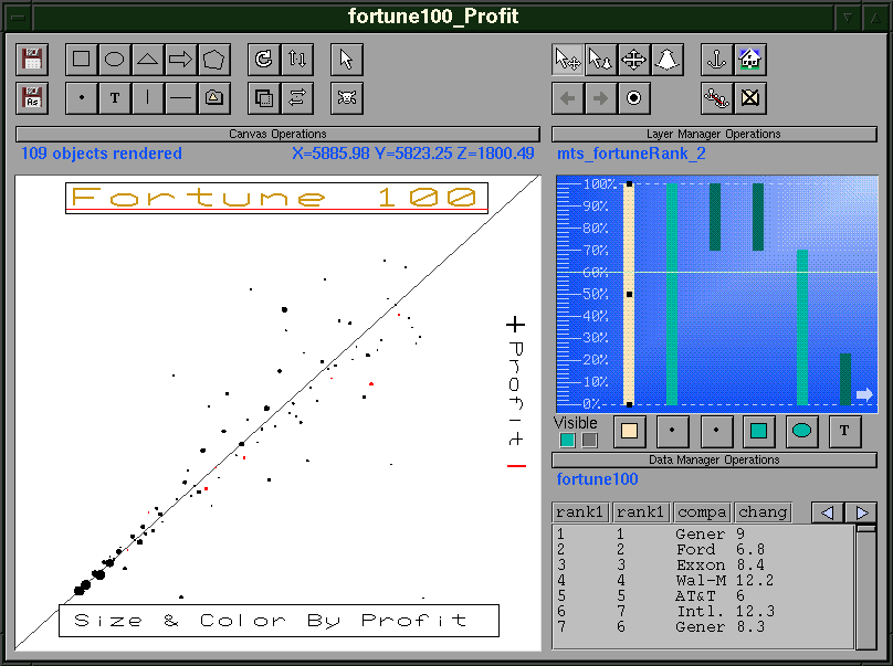
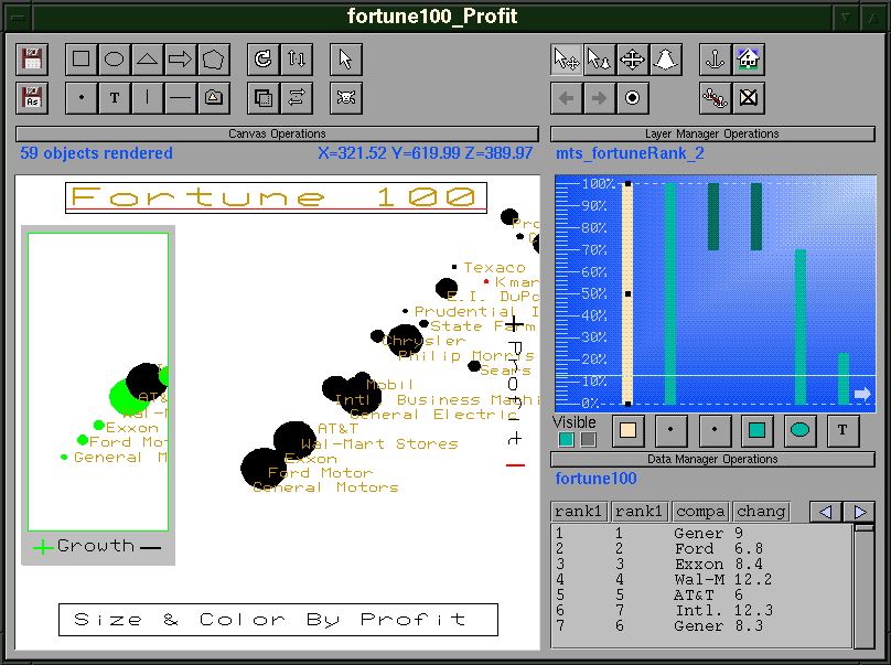
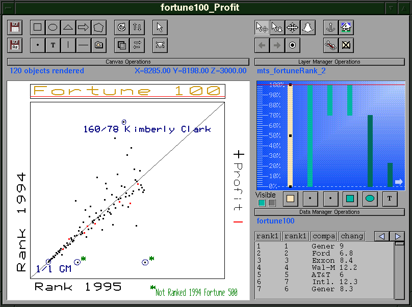
A splash comparing profits of the Fortune
100 companies in the United States.
The first screen shot shows a simple scatter plot of a company's rank in 1994 versus their rank in 1995. General Motors was number one in both 1994 and 1995 (an annotation to this effect appears in the lower left corner). Unlike a regular scatter plot, the dots indicate another attribute of the data. Specifically, the points are colored red or black depending on whether the company made or lost money. In the second screen shot, the points vary in size by overall profit. In the third screen shot, the relative sizes of the points are discernible. The name of each company also appears. Further, there is a portal to another Fortune 100 visualization which shows a company's growth. The visualization indicates that overall growth is inversely proportional to overall profits. Author: Mybrid Spalding (Tioga Research Group) |
![]()